What size prints should I sell?
There are a lot of paper sizes to choose from and sometimes making a decision on this front can get kind of intimidating. Most print shops are more geared towards photographer than illustration, so the paper sizes they offer are going to follow photographic and frame-related standards. The most common sizes are, in ascending order (Metric sizes in mm in parenthesis): 2.5”x3.5”(63.5x89), 4”x6”(102x152), 5”x7”(127x178), 6”x8”(152x203), 8”x10”(203x254), 8”x12”(203x305), 10”x12”(254x305), 10”x15”(254x381), 11”x14”(279x356), 11”x17”(279x432), 12”x15”(305x381), and 12”x18”(305x457). Anything larger than that and you’re getting into poster sizes, which I’ll cover later. 4”x6” is probably the smallest print most people are going to be interested in purchasing, and it is usually very easy to find good deals on 4x6s so it’s a good starting point. 4”x6” has the added benefit of having a very common aspect ratio - 4x6, 8x12, 10x15, and 12x18 all have a 2:3 aspect ratio. This means that if you have a 12”x18” image, you can easily make prints prints of any of those other sizes. If you want to offer the same image in a multitude of sizes, a 2:3 aspect ratio is probably the way to go.
If you’re less concerned about having - or even specifically don’t want to have - the same image in different sizes, you’re probably just best off using whatever size you feel suits the image best. Play around with the canvas sizes a bit and see what sort of aspect ratio you like composing pictures in best. Finally, if you’re new to the world of prints and don’t really feel like diving in to all of this nonsense quite yet you can always use good old 8.5”x11”. Honestly, most of your customers won’t terribly mind.
What DPI should I draw at?
This one comes up a lot with people who have done a bit of research on printing and gotten themselves a bit confused. DPI stands for Dots Per Inch, and is a term referring to the number of tiny dots of ink a printer will place per inch of paper. A printer typically has a range of DPI it is capable of, with lower DPIs often consuming less ink. (A home inkjet printer, for instance, is usually capable of 300-600 DPI max.) The higher the DPI, the crisper the image will look. (Up to a point, that is. Eventually the human eye really can’t tell the difference.) The DPI an image is printed at, however, has nothing to do with the image itself or with your drawing it. What you want to be concerned about is PPI. (For a period of time, DPI was used to refer to both printing and screen, but it caused quite a lot of confusion.)
PPI stands for Pixels Per Inch, and it pretty self explanatory. It is the number of pixels displayed on your screen that represent one inch of length in print. So at regular web resolution of 72 PPI, a single row of 72 pixels would print as one inch across. (Note that the number represents the number of pixels in a flat inch, not a square inch. So a square inch at 72 PPI would contain 5,184 pixels!) The larger your PPI is, the larger of a picture you’ll actually have to draw. An 8”x12” print at 300 PPI is a lot easier to draw than an 8”x12” print at 600 PPI. On the other hand, 600 PPI will be able to have a lot more detail packed into it, assuming you have a printer that can handle it.
Typically you want a lower PPI than DPI. This is because a single pixel can be any colour, but tiny dots of ink can only be one of four colours. So you want a bunch of dots of ink in a single pixel in order to replicate the colour you’re looking for! 72 PPI is the default most art programs and scanners are set to, but it is completely useless for print. The resolution is so low you’ll actually be able to /see/ the pixels in the print version. 150 PPI is the bare minimum I’ve seen anyone work at, but the print usually turns out pretty fuzzy. 300 PPI is a good standard. Prints at 300 PPI usually turn out pretty cleanly and it isn’t too difficult of a size to work at. 600 PPI is another common standard. It takes a lot of effort to draw at this size, but if you are getting your pictures professionally printed it can be well worth it. (It has the added benefit of allowing you to print a picture twice as large at 300 PPI if you wind up wanting to sell a larger size of it!)
How do I keep my colours from printing out all muddy?
So you have this super-amazing print with vivid colours everywhere. Beautiful rainbows, bright reds…. but when you receive your prints, everything looks dull and grey! What gives?
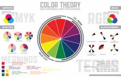
The reason this happens has to do with the difference between how your screen makes colours and how the printer makes colours. Your screen is made up of lots of little lights emitting either red, blue, or green light at you. Because it is creating these colours with light directly, it is working on what is known as an additive colour model. You’ve probably read about this when studying light in school, so I won’t go too far into it. In an additive colour model, the primary colours combine to make other, brighter colours. If you combine them all together, you’ll get white light! (Interestingly, this is entirely do to with how the eye sees colour rather than a property of light itself. Red and Green lights will combine to make a light your eye sees as yellow, even though no actual yellow light is being emitted!) Every colour that your screen produces is created by combining those three colours of light.
Now, anyone who has played around with paint knows that this isn’t at /all/ how physical mediums work. Mixing red, green, and blue paints would create a disgusting green-brown mud. This is true for your printer as well! Physical mediums work on a subtractive colour model. Rather than emitting light at you, a print is merely reflecting light at your eyes. All of the colours created in a subtractive colour model are created by putting pigments down that absorb all of the light except for the colour that you want to be seen. So unlike in an additive model, where adding more colours results in more light getting to your eye, adding colours in a subtractive model results in less light getting in because it is all being absorbed. The end result of all of this is that there are colours that can be created on a screen that can never be created on paper, and there are colours that can be painted or printed that actually cannot be displayed on a screen. CONTINUED IN LINK


